UFCU Projects
Role: Email Marketing Specialist
Contributions: Branding, Design, UI Design
Tools: Figma
Medium: Mobile Application
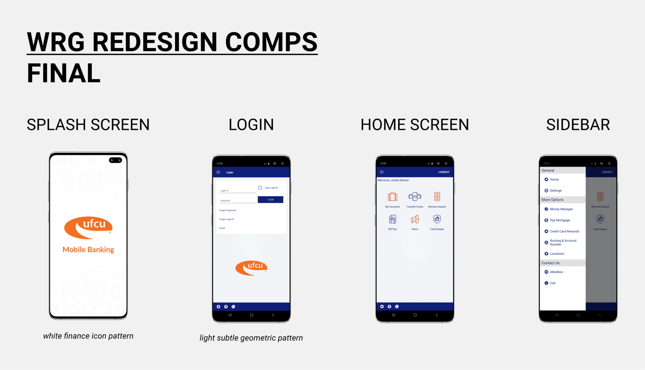
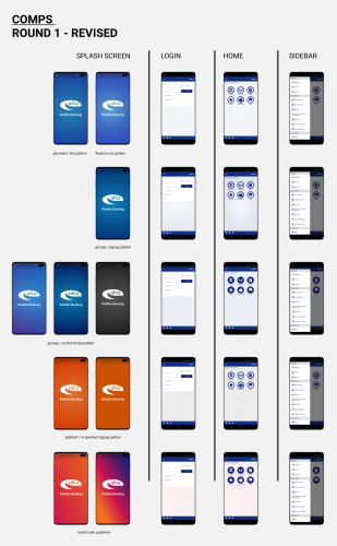
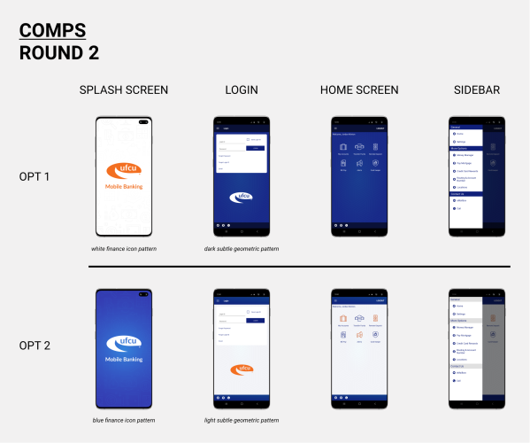
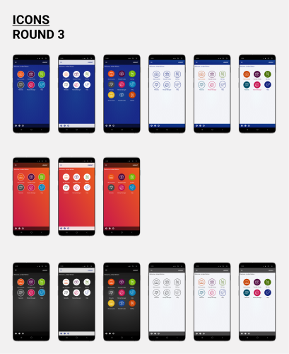
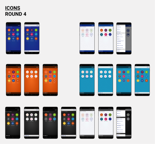
I was approached by the product manager of digital banking, who was interested in my branding work for other departments. They were transitioning to a new mobile app platform and wanted to customize the interface. I used Figma to present a number of rounds to him and the executives. At first, I was conservative in my approach (as I had come to expect from the organization), but they insisted they wanted something more modern, with line art icons. I cobbled together several iterations using hand-drawn mixed with purchased vector graphics. The end result was a step further than we had taken previous marketing, and something we were proud to create.
Role: Email Marketing Specialist
Contributions: Branding, Design, UI Design, Strategy, Front-End Dev, Data Analytics, Project Management
Tools: Figma, Dreamweaver, Documatix
Medium: Email Marketing
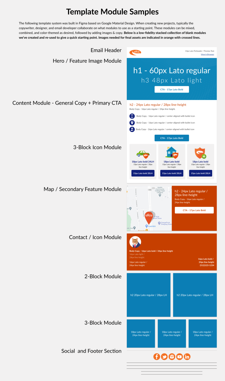
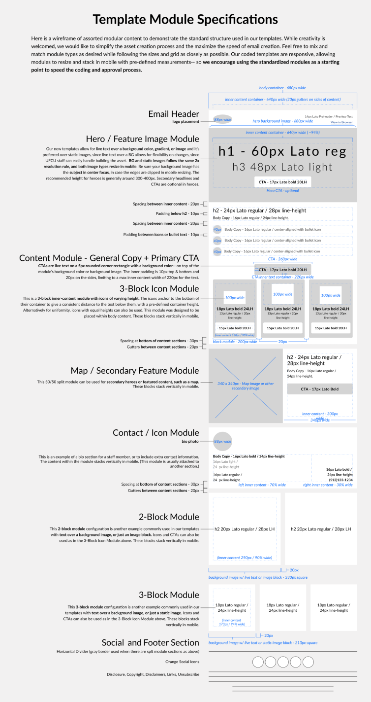
When I joined the marketing department at UFCU, email deliverables were being mocked up in MS Word and built within the ESP’s WYSIWYG editor to generate non-responsive emails that were not always up to brand standards. There was no design approval, custom-coded template system, or QA process in place, so I suggested the implementation of Figma (a cloud-based real-time version of Sketch) in order to create standardized templates for approval before building out campaigns. From Figma, we were able to quickly generate accurate design comps for approval.
These optimizations reduced overall time spent by the marketing team creating emails by 27%. The sample displayed is the original high fidelity Figma template for the project, created for building Seminar emails.
Over 70% of emails were being opened by members on mobile, emphasizing the need for responsive code. The primary client used by members was Gmail, also accounting for around 70% of the open rate. I opted to use hybrid HTML code, which allows emails to have responsive display in mobile, specifically Gmail. After creating the outer shell of the body code, I built a modular template library in fluid-resizing hybrid code. By continuously expanding the library with template modules, I am able to quickly insert predefined code snippets when creating new content.
I also introduced Google tracking to emails with tag naming conventions in order to better analyze specifically what is being clicked and to follow users as they interact with the UFCU website. I created a link-building spreadsheet within Google Sheets in order to quickly create fully-tracked URLs for all teams within the marketing department. In addition, I worked with the Analytics Team to integrate data reporting from the email CRM and Google Analytics into our analytics cloud software. The result was in-depth insight into the success of each channel of marketing based on user clicks, with customized data visualizations.
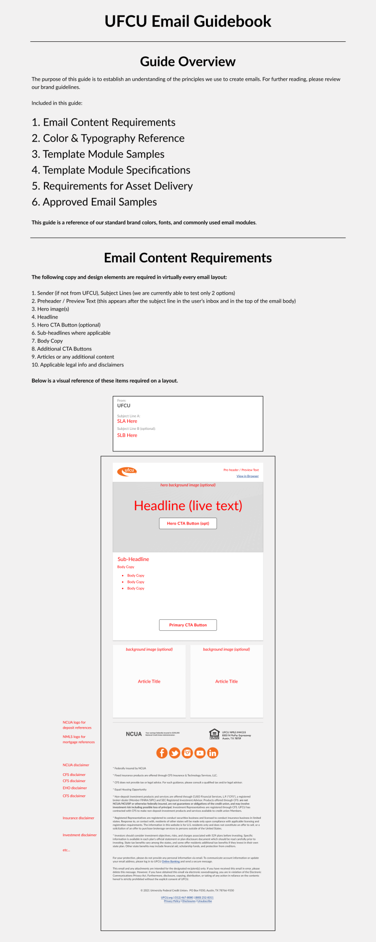
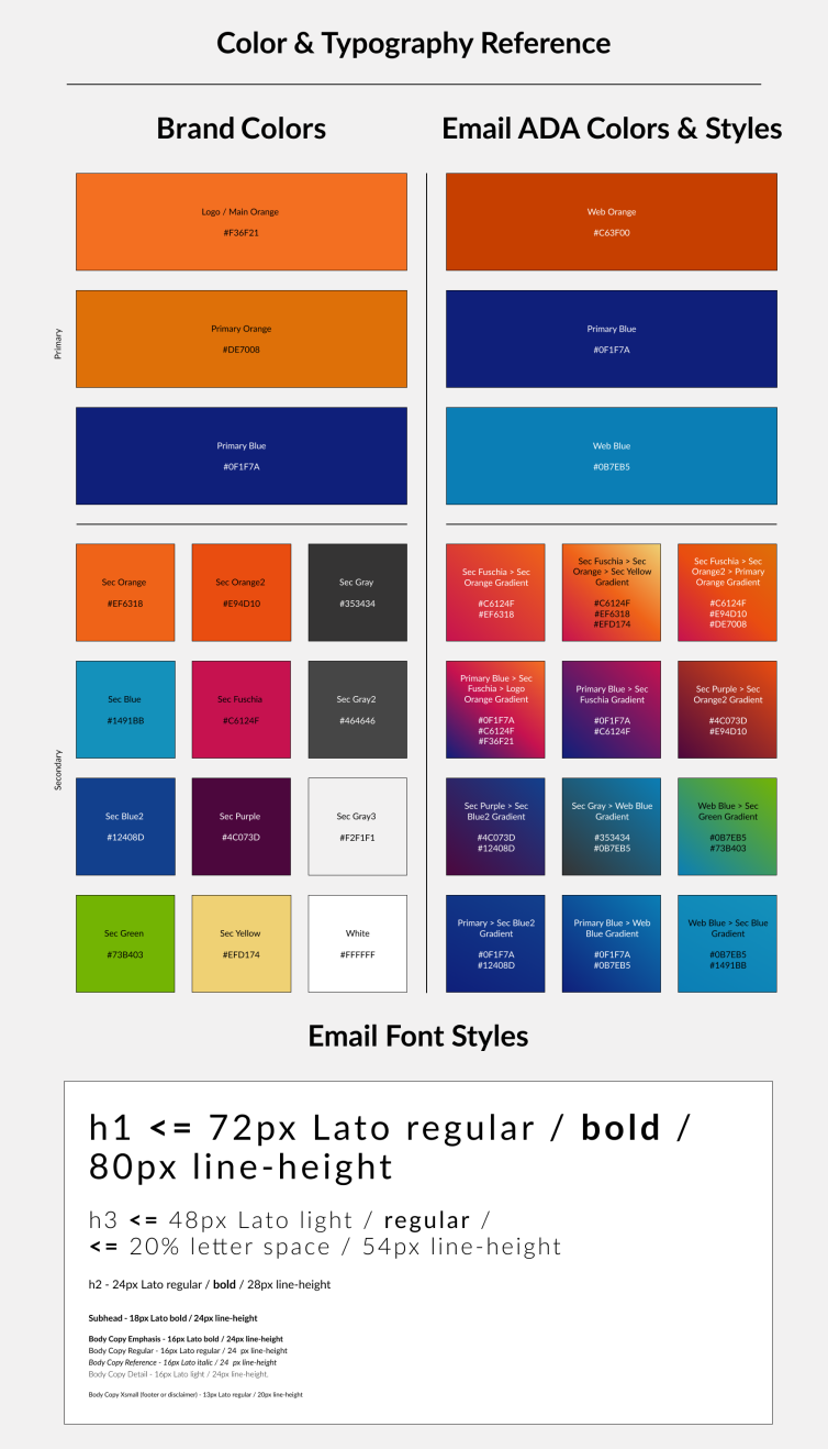
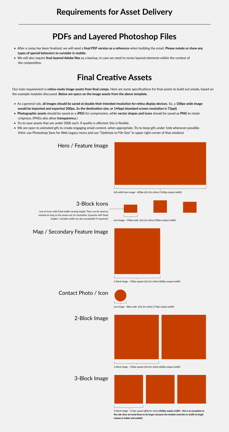
Utilizing all the learning from above, I devised a guidebook of best practices for creating assets for use within email marketing. This guidebook is available to the marketing team and supplied to third-party vendors when work is outsourced.
Role: Email Marketing Specialist
Contributions: Branding, UI Design, Front-End Dev, Project Management
Tools: Figma, Dreamweaver, Documatix
Medium: Email Marketing
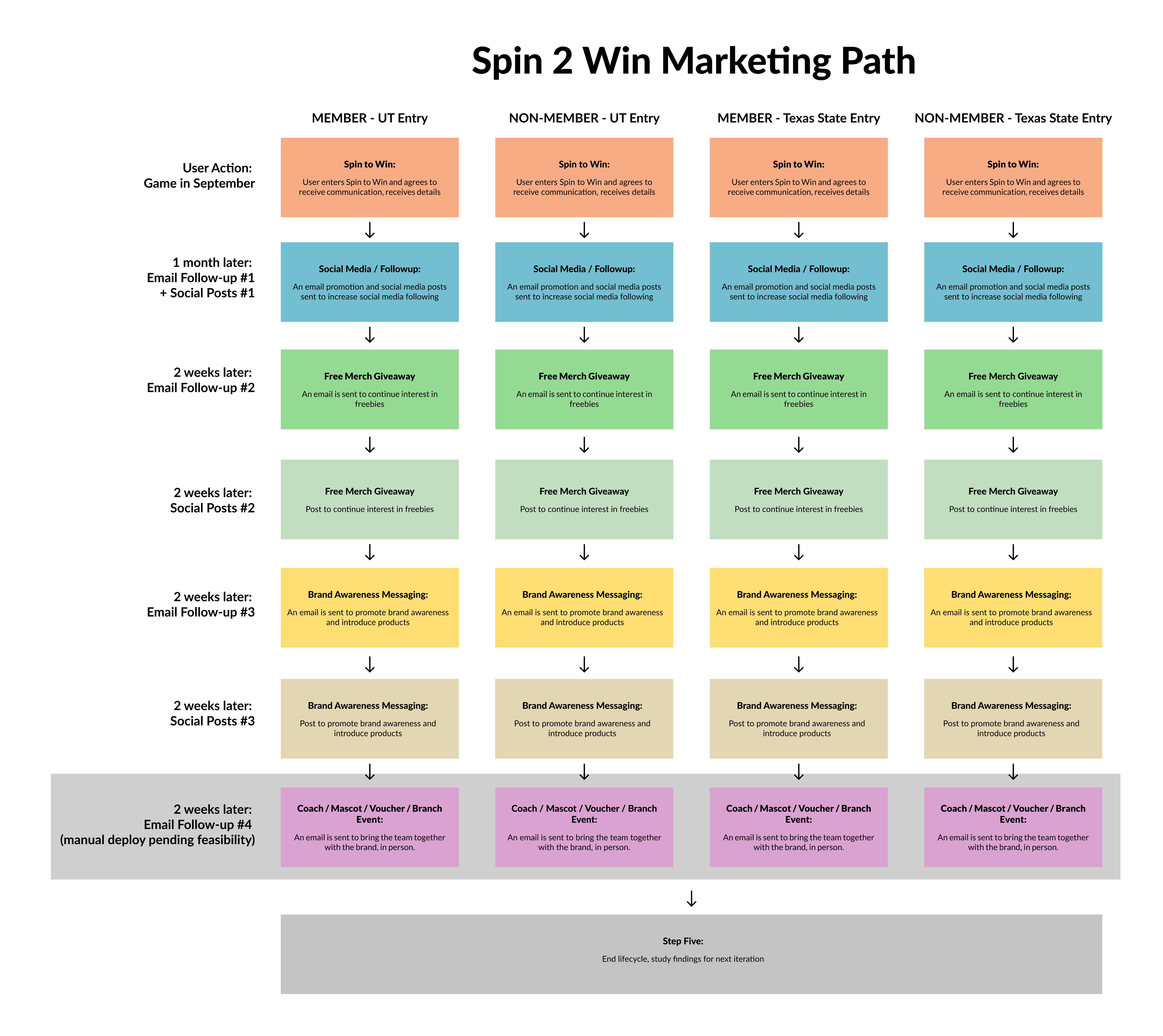
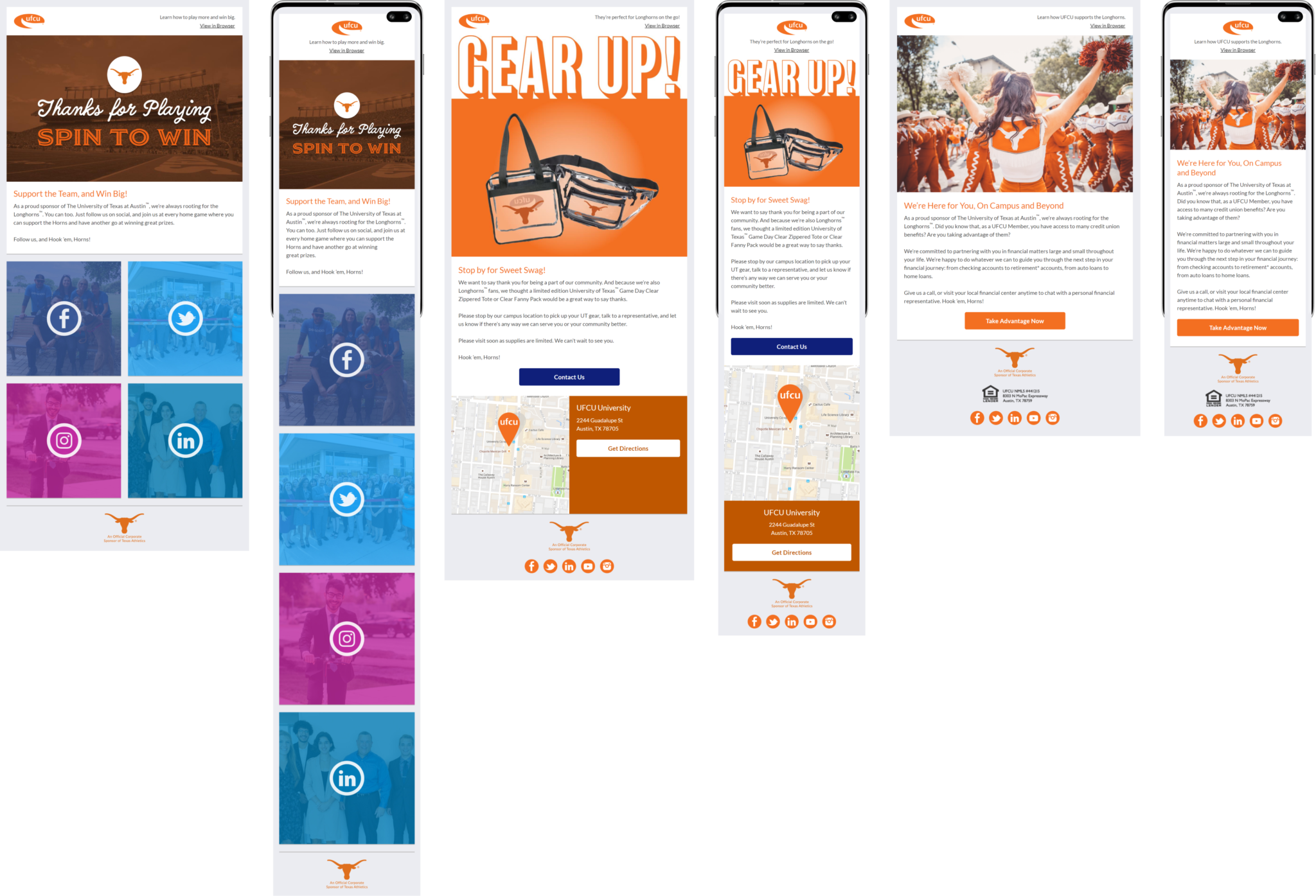
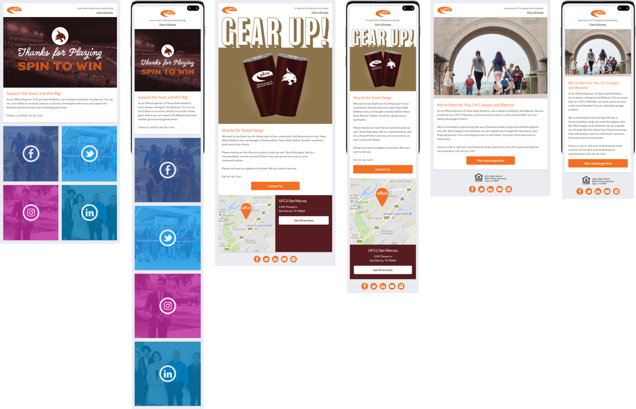
I was tasked with developing a multi-touch, long-term email program to cultivate leads gained via UFCU’s Spin to Win online contest for students, where they can opt-in to email marketing. This included email and social coordinated effort for the marketing team’s first-ever life cycle campaign and the first acquisition program. (The organization had never needed any advertising to attract new members.) I created the diagram shown in order to pitch to the team to support the project.
- Fan Acquisition Email – promotes social channels in order to gain a wider audience for brand awareness and future contests
- Merch Giveaway – attracts subscribers and fans to branches where they are encouraged to open accounts
- Brand Awareness Email – reminds students of UFCU’s accessibility and support
Role: Email Marketing Specialist
Contributions: Branding, UI Design, Illustration, Front-End Dev, Project Management
Tools: Figma, Dreamweaver, Documatix
Medium: Email Marketing
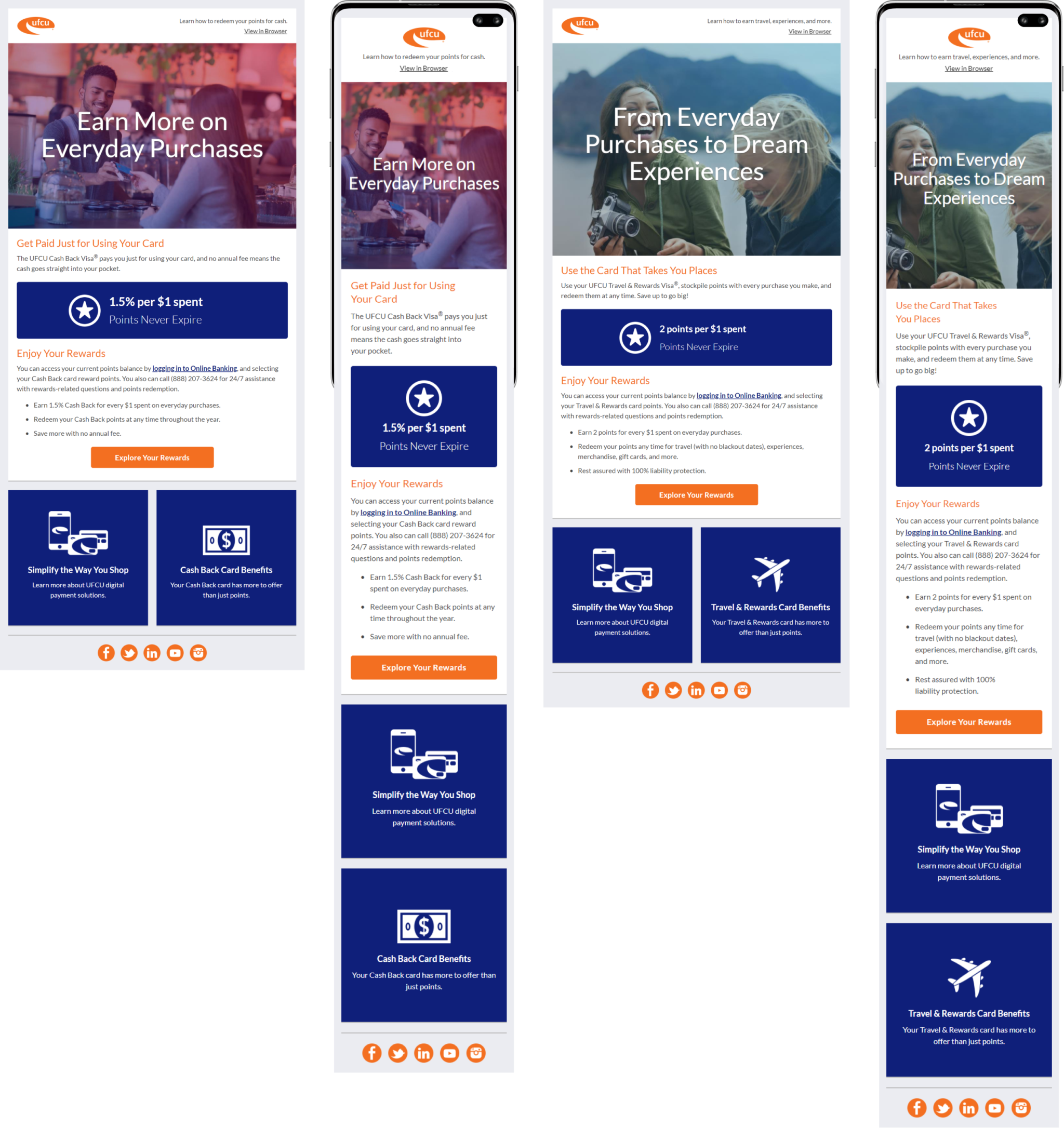
UFCU needed a compelling way to promote their newly released credit card program. I worked with the marketing team to select engaging images to appeal to the target audience and created new responsive modules to better call out the features of the card.
Role: Email Marketing Specialist
Contributions: UI Design, Strategy, Front-End Dev, Project Management
Tools: Figma, Dreamweaver, Documatix
Medium: Email Marketing
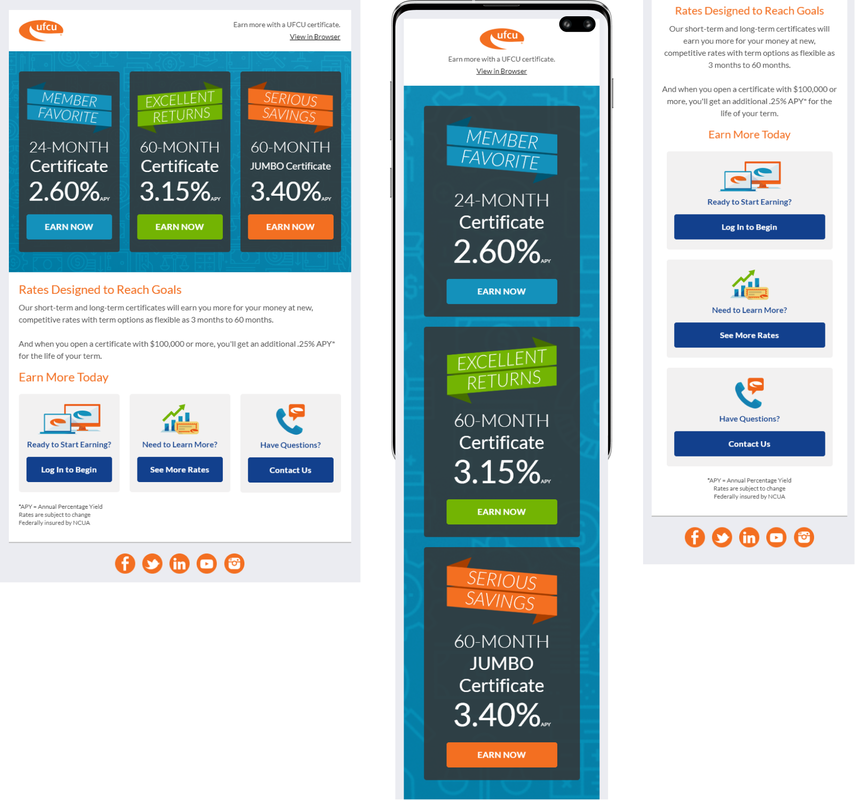
One of UFCU’s savings products is a certificate of deposit (or CD), for which the marketing needed to be refreshed. I opted to create a flashy new ad with a background image and transparent rate blocks that stack for mobile. I wanted to also bring a higher yield jumbo option into the mix to drive more curiosity. The result was over 30% open rate and over 200% increase in CTOR from previous versions.
Role: Email Marketing Specialist
Contributions: Branding, UI Design, Illustration, Animation, Front-End Dev, Project Management
Tools: Figma, Dreamweaver, Documatix
Medium: Email Marketing
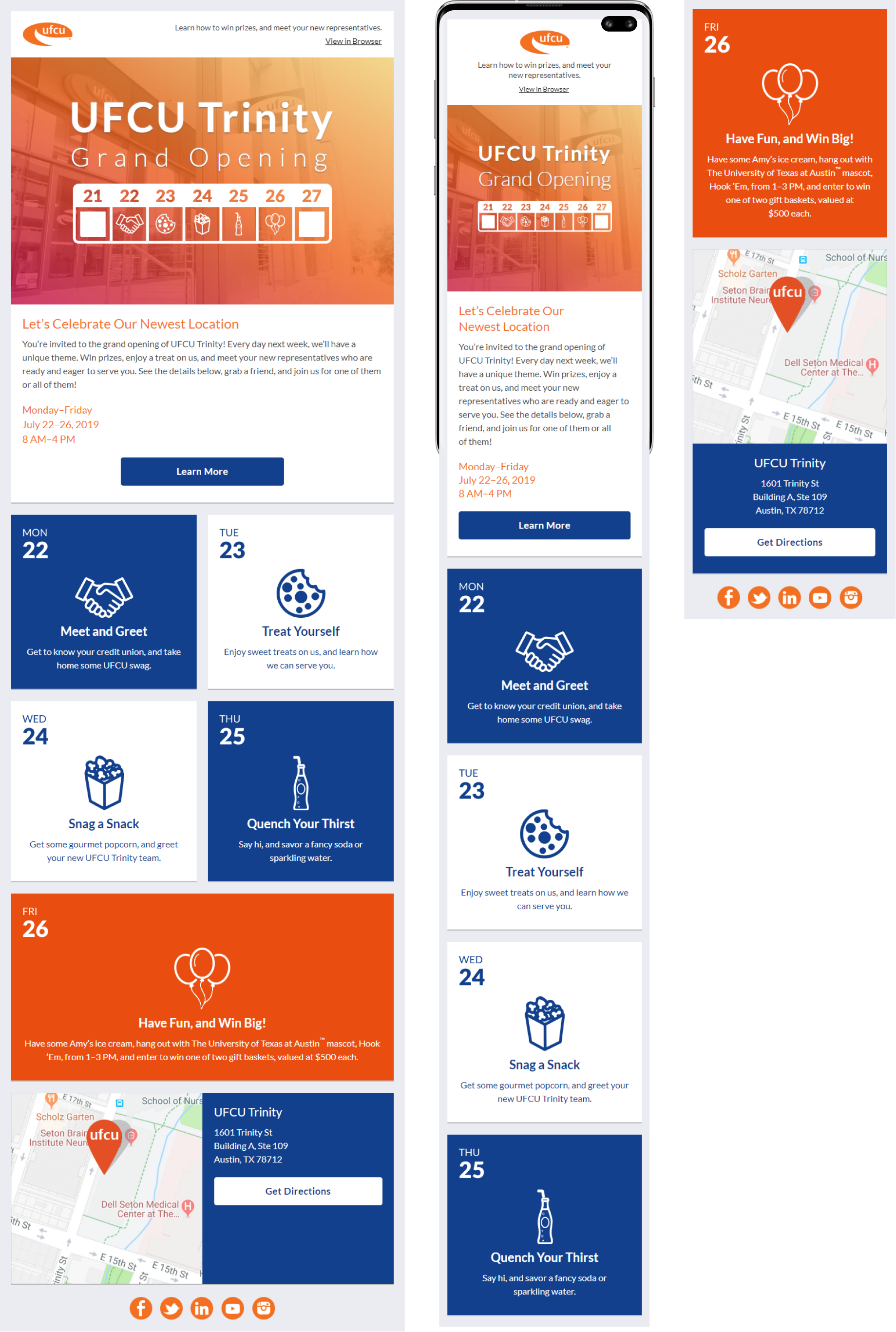
The new UFCU Trinity branch hosted a Grand Opening week, and the marketing team was asked for support to spread the word through various media channels. I created a hero image with an animated calendar and created various illustrations throughout the piece. Our other channels promoted the event with this visual theme as well.
Events offered free refreshments and a prize giveaway with daily themes:
- Mon 22- Meet and Greet (merch giveaway)
- Tue 23- Treat Yourself Tuesday (cookies)
- Wed 24- Snag a Snack (gourmet popcorn)
- Thur 25 – Quench Your Thirst (fancy sodas and sparkling water)
- Fri 26 – Have Fun and Win Big (basket giveaways, UT mascot, and Amy’s ice cream)
Client: UFCU
Role: Email Marketing Specialist
Contributions: Branding, UI Design, Strategy, Front-End Dev, Project Management
Tools: Figma, Photoshop, Dreamweaver, Documatix
Medium: Email Marketing
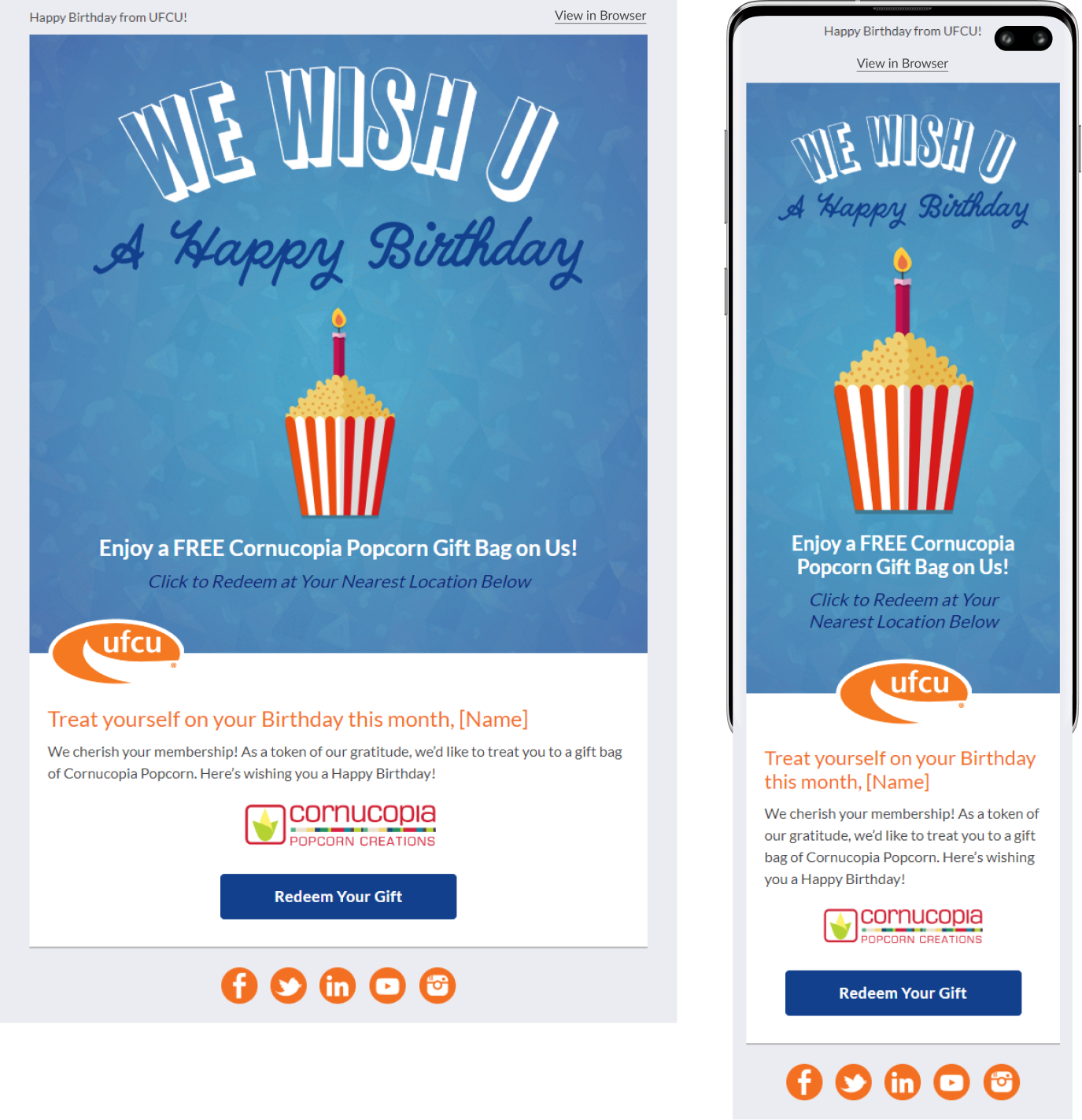
UFCU maintains strong relationships with its members, and the Marketing Team was brainstorming campaigns to keep members engaged with a personal touch. Since our database included birth dates, I created a fully animated birthday campaign to be automatically sent the month of the member’s birthday. The email features an animated gif background (popcorn falling) with another animated gif (candle flickering) on top.


